CISSA Onboarding Experience
Overview
Replaced confusing manual sign-ups with one-tap NFC check-in — driving 20% membership growth and cutting verification from 10 minutes to 5 seconds.
Role
Lead Product Designer (Strategy, UI, User Testing)
Web Design
Date
Dec 2023 – Feb 2024 (3 months)
Outcome
20% membership growth · 1,500+ interactions · 10min → 2min verification
The Challenge
Joining a university club shouldn't feel like filing a tax return. But for CISSA's 2,000+ students, onboarding meant:
5 touchpoints per user — manual verification across spreadsheets, emails, and forms
10+ minute wait times — long queues at events causing visible drop-offs
3 disconnected platforms — students confused by disparate systems with no clear flow between them
Why NFC?
We evaluated three methods to solve the queue crisis:
QR CODES
QR CODES
MANUAL LISTS
MANUAL LISTS
NFC CARDS
NFC CARDS
SPEED
SPEED
Moderate
Moderate
Slow
Slow
Fast
Fast
COST
COST
Cheap
Cheap
Free
Free
High
High
FRICTION
FRICTION
High
High
High
High
Low
Low
NFC won because it delivered the one thing the others couldn't: zero-friction verification. One tap, instant confirmation, done.
The Opportunity
One line guided every design decision:
Reduce the time to decide on a meal to under 3 minutes, by creating a restaurant discovery platform that's curated to each user.
Key Design Decisions
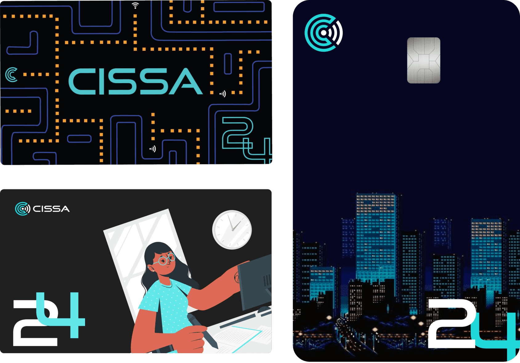
The card as a product.
Iterated on matte vs. gloss finishes to ensure a premium feel students would keep in their wallets — not toss in a drawer. A card left at home can't verify anything.
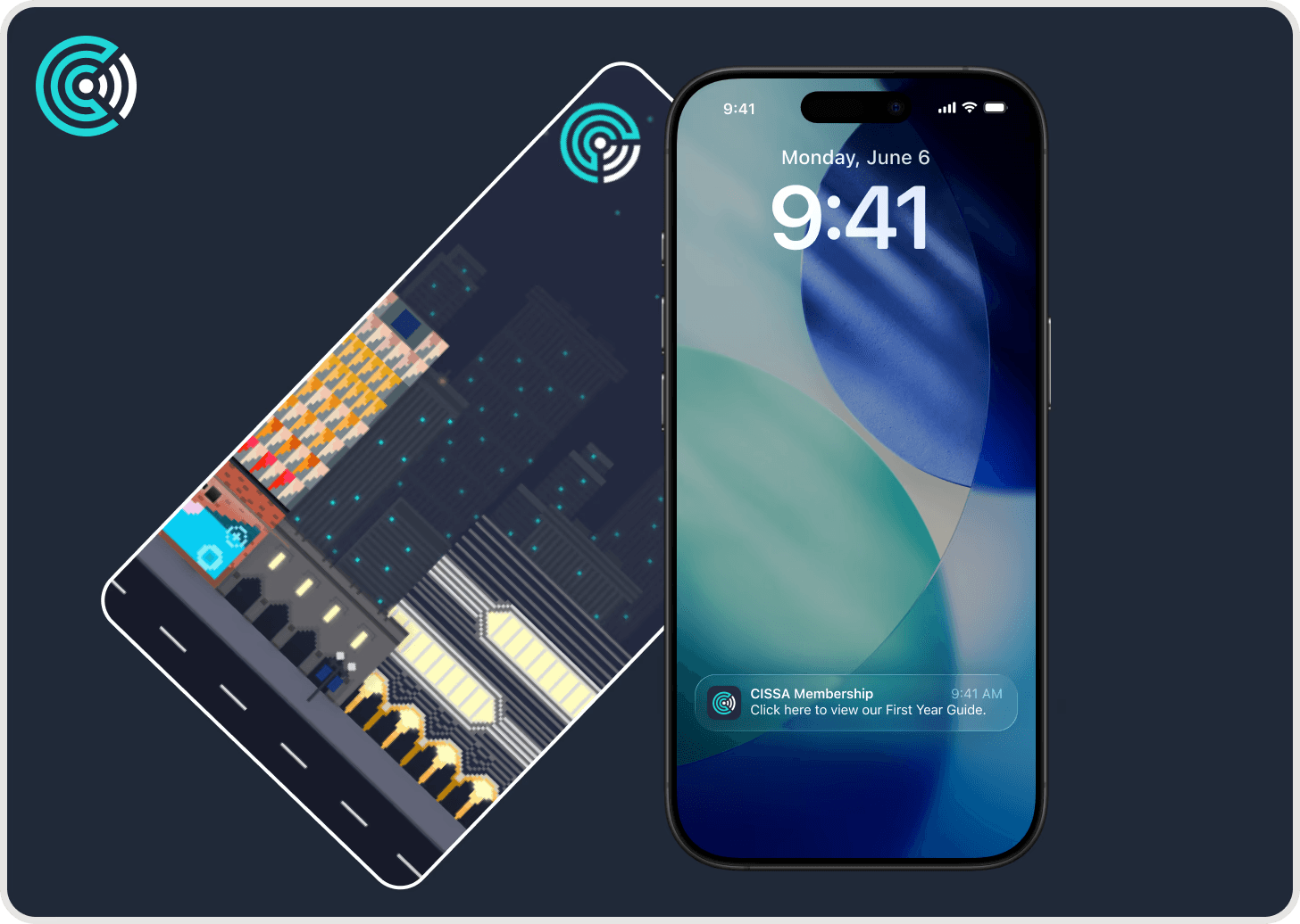
One tap, no login
Tapping the card launches a mobile-optimised webpage showing membership status and upcoming events. No app download. No password. The tap itself is the authentication.
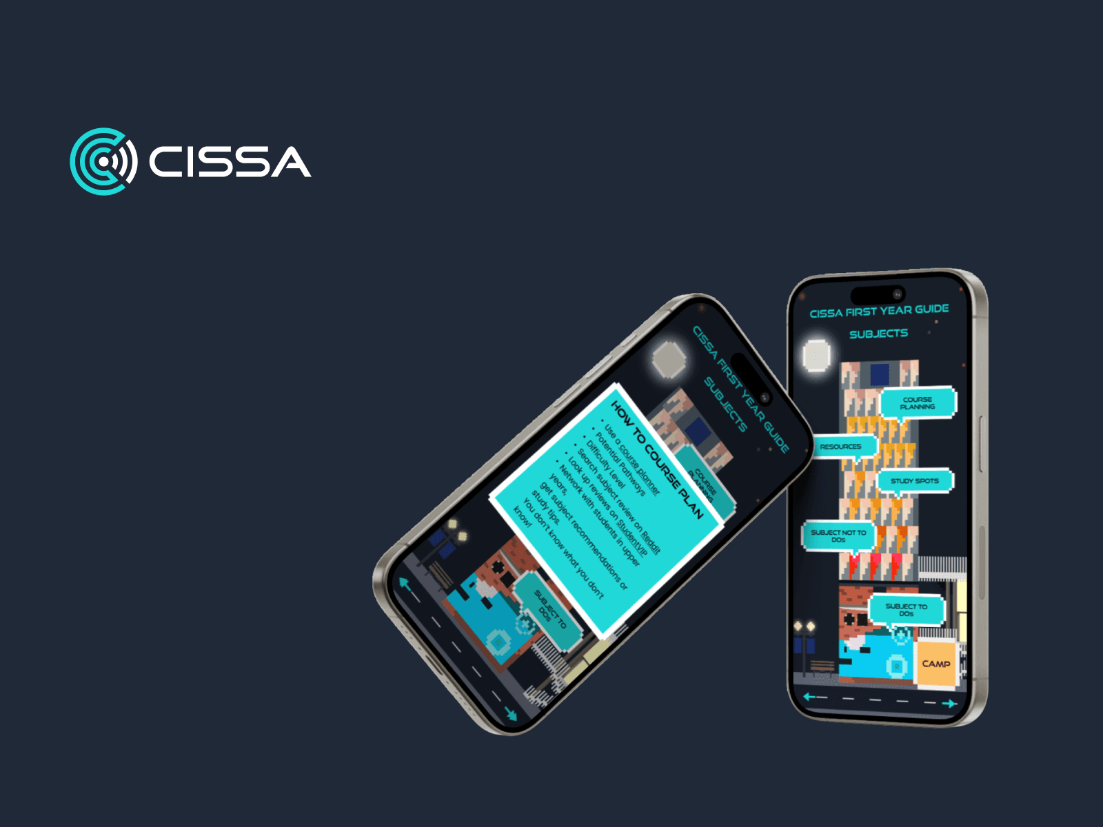
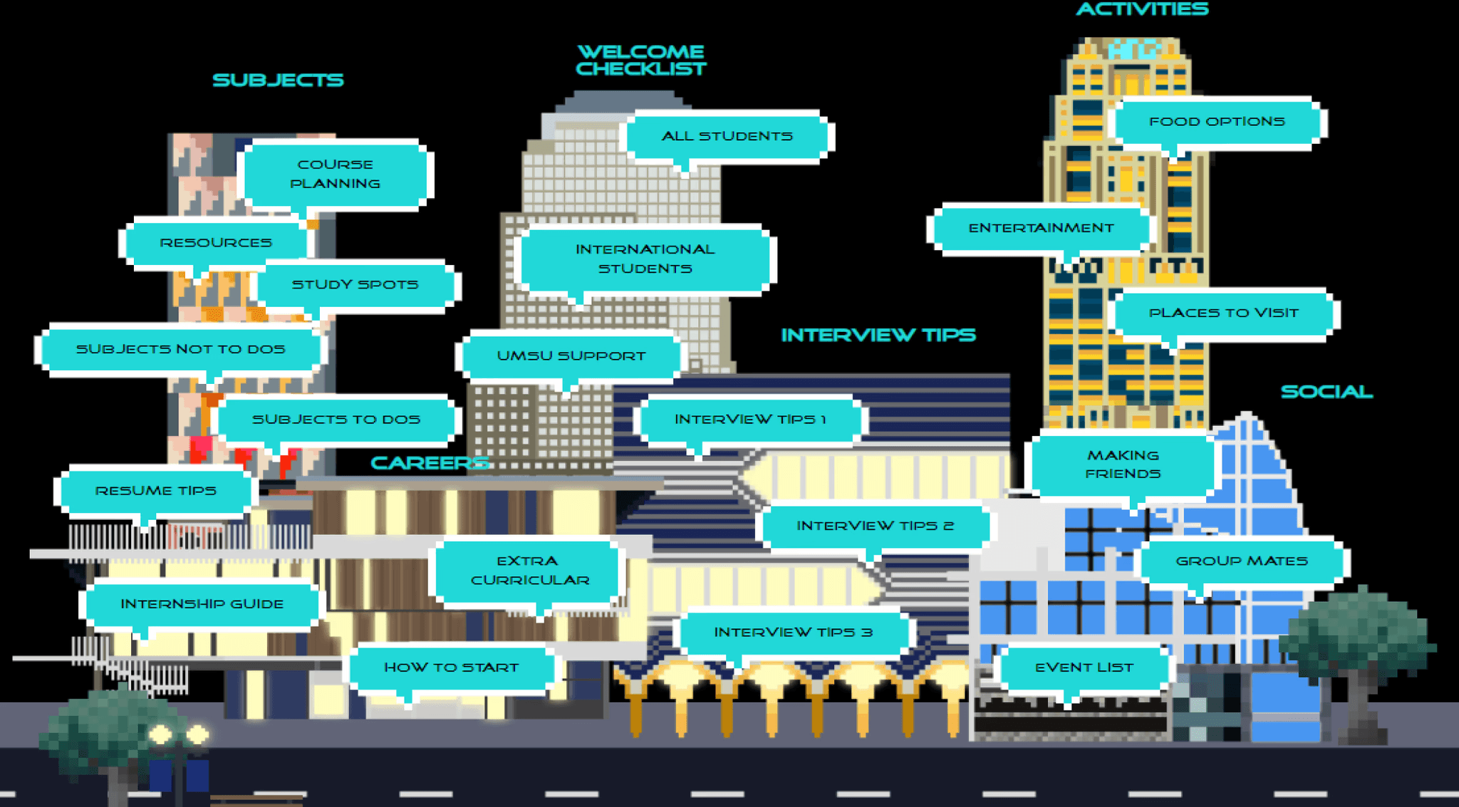
Gamified campus discovery.
Turned the First Year Guide into an interactive campus map. Integrated diamond sponsors (Jane Street, ANZ) as interactive buildings — giving sponsors measurable visibility and CISSA a new revenue stream that funded the NFC programme.
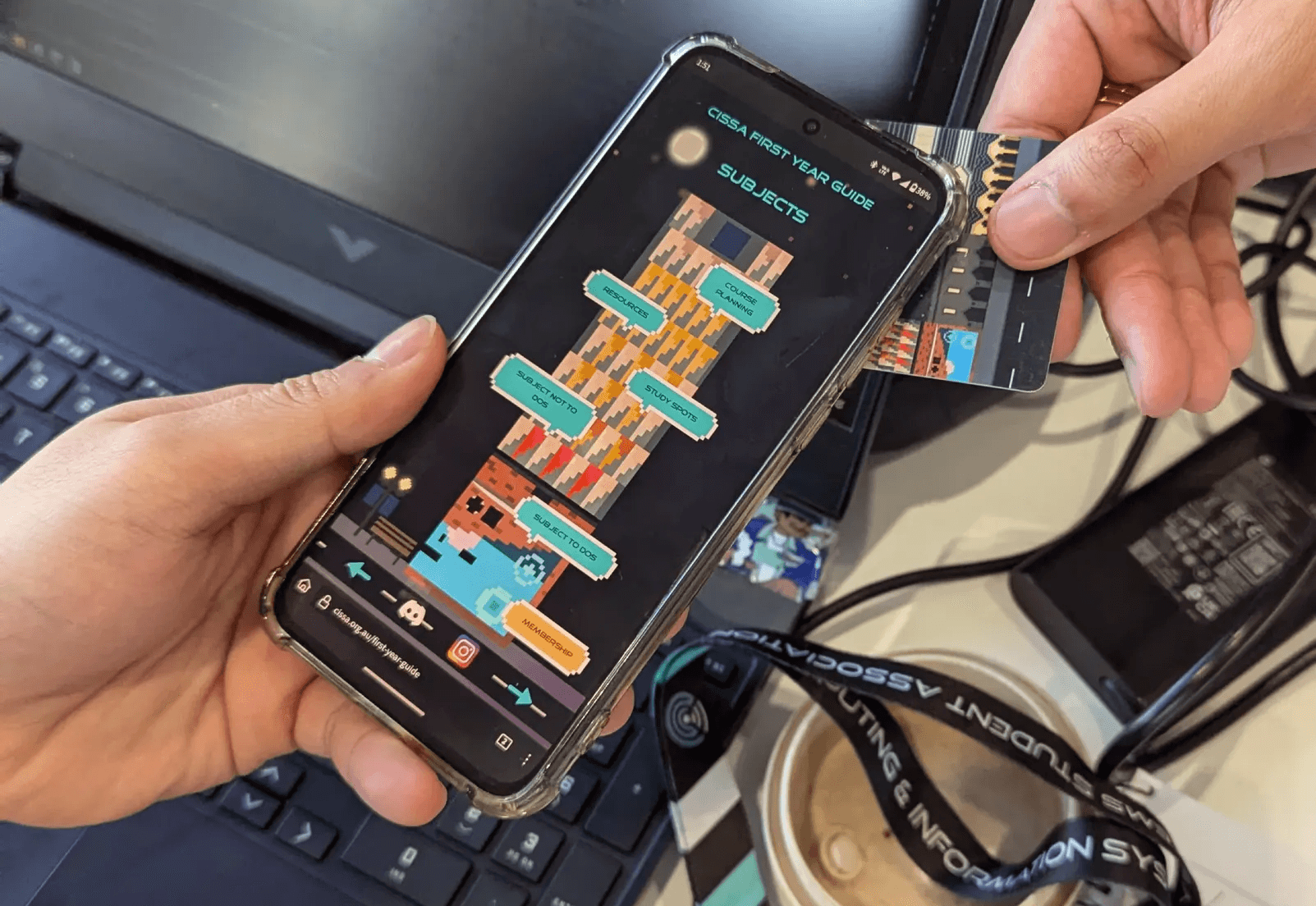
Fixing the "first tap" confusion.
Testing revealed users didn't know if the tap worked — there was no feedback. Added a success state animation and push notification. Half a second of feedback eliminated all the confusion.
Results

20%
20%
membership growth.
1500+
1500+
Digital interactions
<2
<2
minutes to verify
What I'd Do Differently
Security first. The first batch lacked robust NFC security — the URL redirect could have been altered. Low risk in a student club context, but in any other environment, it would have undermined trust. I'd invest in encrypted tags from day one, even with a smaller batch.
Pilot before mass launch. We went straight to full rollout. A batch of 50–100 cards would have caught the "first tap" confusion earlier and let us iterate before scale.
What I Learned
The best onboarding is invisible. Five seconds from tap to confirmation. No forms, no logins, no "please verify your email." When onboarding is invisible, users remember the experience — not the process.
Design can create revenue. The sponsored campus map wasn't in the original brief. It emerged from thinking about how to fund the NFC programme sustainably. Designers who think about business models create more lasting impact.


Not sure what's confusing your users?
Or email me at hello@kaizerstudios.com —
We'll respond within 24 hours
©Sean Khoo 2026. All rights reserved.
Not sure what's confusing your users?
Or email me at hello@kaizerstudios.com —
We'll respond within 24 hours
©Sean Khoo 2026. All rights reserved.
Not sure what's confusing your users?
Or email me at hello@kaizerstudios.com —
We'll respond within 24 hours
©Sean Khoo 2026. All rights reserved.