GymGoer
Overview
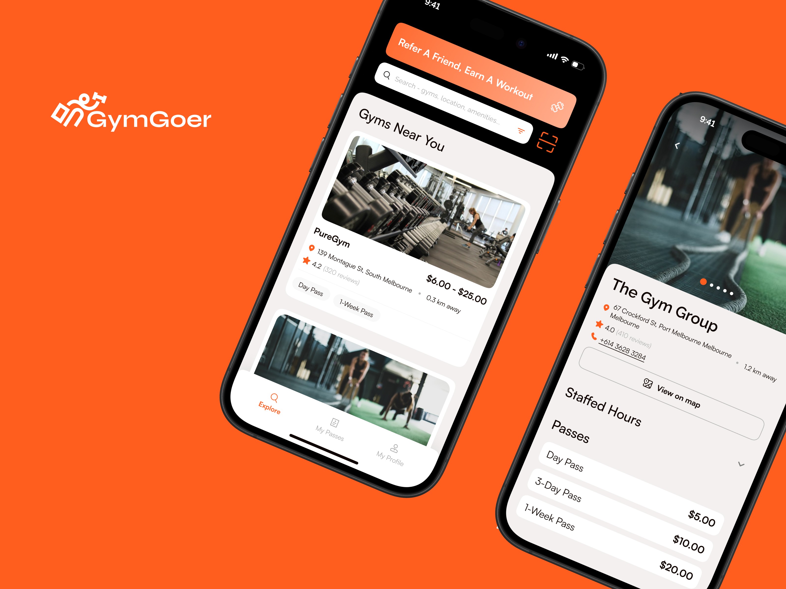
A casual pass marketplace connecting travellers to quality gyms nearby — without contracts, commitments, or signing hassles.
My Role
Product Designer & Product Manager (Strategy, UI)
Mobile App Design
Date
Mar 2025 – Jan 2026
Team
Techne HQ (UX Designer, Development Team)
Outcome
29+ gyms onboarded · 650+ user downloads
Design work created during my role at Techne R&D. Copyright and IP belong to the founder, Ryan Clarke. Shown for portfolio purposes.
Design work created during my role at Techne R&D. Copyright and IP belong to the founder, Ryan Clarke. Shown for portfolio purposes.
The Problem
Travellers and casual gym-goers face friction at every step when searching for temporary access. Gym chains operate on long-term memberships. Independent gyms lack digital discovery. Users want flexibility; gyms have unused capacity. Both sides are underserved.
The Challenge
The Traveller's Dilemma
Short-term access blocked by long-term contracts, sign-up fees, and complex waiver forms.
The Empty Gym Problem
Independent gyms can't attract casual visitors during off-peak hours. Revenue left on the table daily.
The Discovery Gap
Finding a casual-friendly gym means calling ahead, checking hours manually, and negotiating rates in person.
The Opportunity
We built a two-sided marketplace with one guiding principle: effortless access to the right gym at the right time.
The core insight: users didn't need more gym options — they needed a clear, frictionless path from intent to check-in.
For Users: Discover → Book → Check in. Minimal steps.
For Gyms: Passive customer acquisition from unused capacity. No extra work for staff.

Key Design Decisions
One-tap booking
Traditional gym onboarding involves forms, waivers, and payment negotiations. We stripped it to: select gym → pick time → pay → done. Every screen answers one question and advances to the next.


Transparent peer reviews
Reviews from fellow casual visitors — "Clean facilities, easy check-in, no hassle" — are more useful than aggregate ratings from long-term members. Trust reduces decision time.
Incentivised referrals
Share a link, friend signs up, both get rewarded. No codes, no multi-step redemption. If the referral process is confusing, people won't use it — regardless of the incentive.

Design Principles
Frictionless for users — every interaction reduces steps, not adds them
Viable for gyms — simple enough for staff to manage without training
Scalable architecture — accommodates future gym types and payment models
Results
29+
29+
gyms onboarded
650+
650+
user downloads
$4M +
$4M +
valuation
What I Learned
Two-sided clarity is twice as hard. What's obvious to a gym-goer ("just let me book") is different from what's obvious to a gym owner ("show me the numbers"). Both experiences had to feel like one product.
Design for the staff, not just the user. If the check-in process confused the person at the front desk, the whole experience fell apart — no matter how polished the app was.
More works


Not sure what's confusing your users?
Or email me at hello@kaizerstudios.com —
We'll respond within 24 hours
©Sean Khoo 2026. All rights reserved.
Not sure what's confusing your users?
Or email me at hello@kaizerstudios.com —
We'll respond within 24 hours
©Sean Khoo 2026. All rights reserved.
Not sure what's confusing your users?
Or email me at hello@kaizerstudios.com —
We'll respond within 24 hours
©Sean Khoo 2026. All rights reserved.