Kaizer Design System:
A Decision-First Framework
Overview
A design system built on one conviction: guide users toward clarity without trapping them. Grounded in Hick's Law, semantic tokens, and Tailwind-ready architecture.
My Role
Product Designer
Design System
Date
2025 - Current
Status
In Development
The Problem
My previous design system was a collection of components without conviction. Multiple border radius values. Inconsistent spacing. Naming conventions that were painful to filter during development.
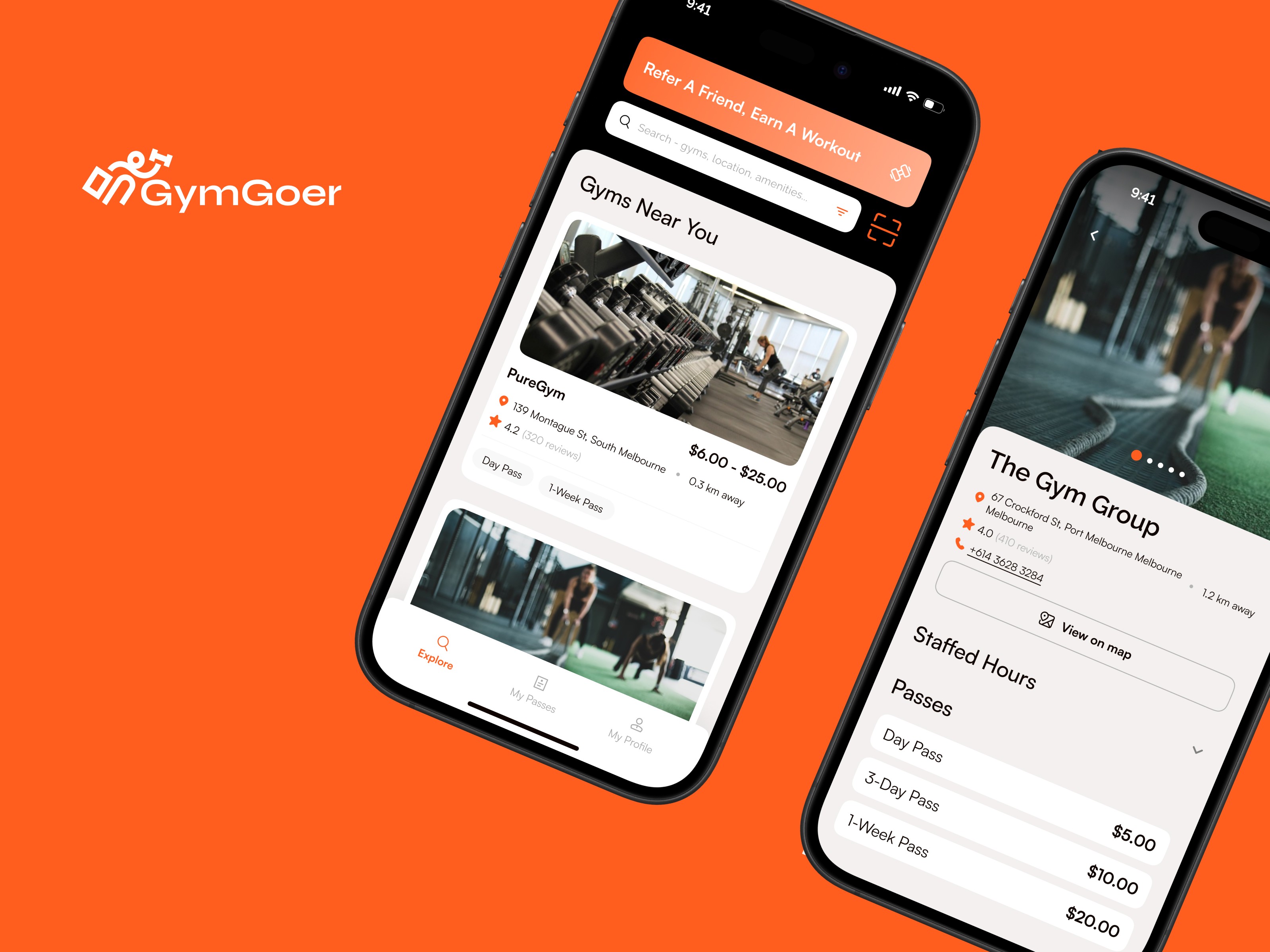
When I started building a food discovery app designed to reduce decision fatigue, the irony was hard to ignore: my own design system was creating decision fatigue for me.
I needed to rebuild from first principles.
BEFORE

AFTER

The Philosophy
"Guide decisions, preserve agency, earn trust through craft."
Every component, token, and pattern in Kaizer passes through this filter:
Guide decisions — help users arrive at the right choice through progressive narrowing
Preserve agency — never trap the user; they always retain freedom to choose differently
Earn trust through craft — polish isn't decoration, it's a trust signal
Core Principles
Progressive Reduction
"Start broad, end certain."
Grounded in Hick's Law — decision time increases with the number of choices. The system enforces a hard rule: never present more than five options without grouping, hierarchy, or progressive disclosure.
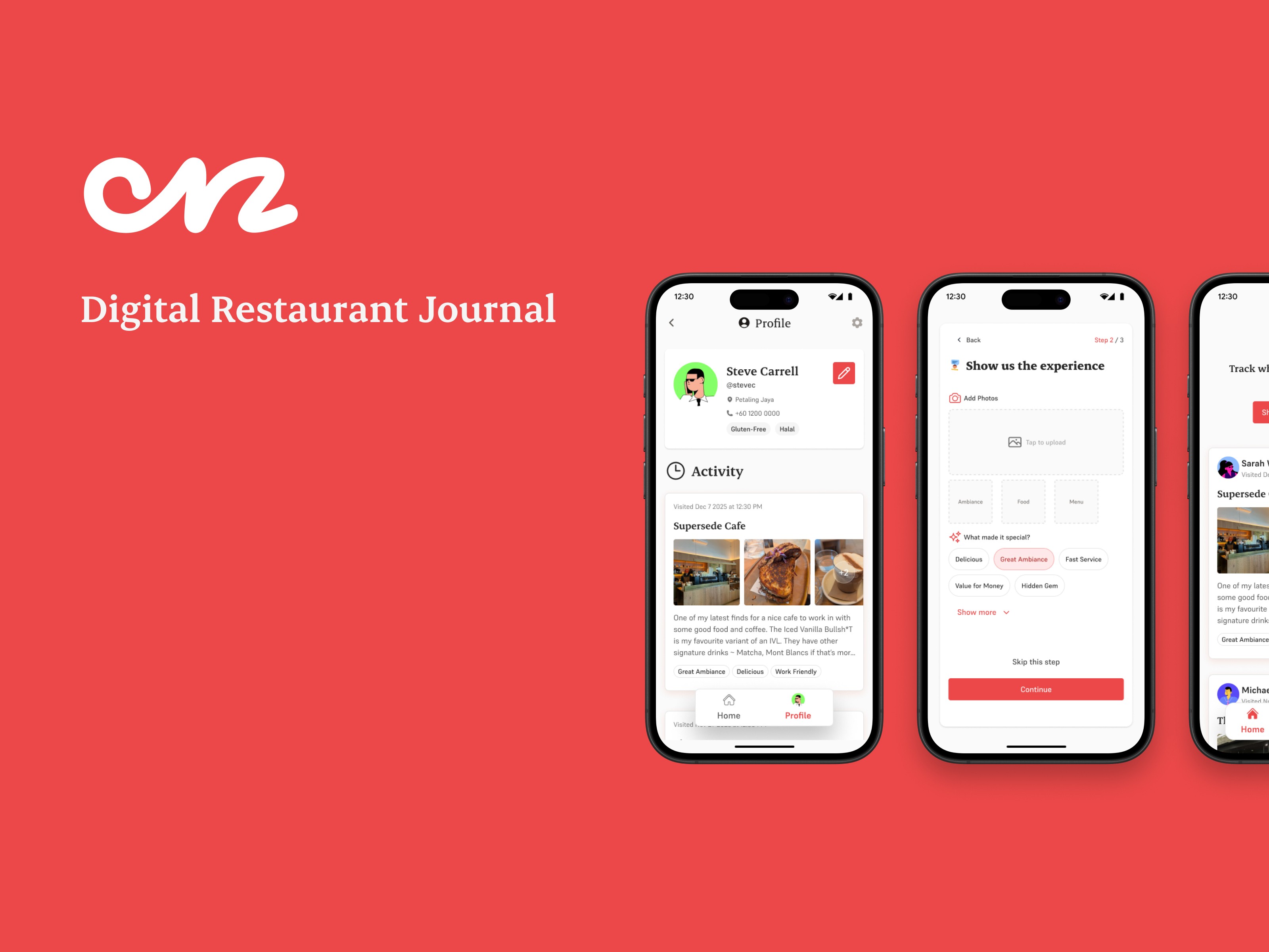
In practice: Onz surfaces five restaurant recommendations per meal. Not fifty. Not twenty. Five.


Preserved Agency
"Guide, never trap."
Every guided path has an exit. Every default is overridable. When Onz recommends a restaurant, the user can always choose differently.
One deliberate decision: I removed the search bar entirely. If users can search the entire web of options, we've failed to curate.
Earned Aesthetic
"Polish signals trust."
If an element doesn't aid comprehension, remove it. Early designs had four brand colours. I stripped it to two — red and peach — with neutral supporting tones. Calmer interface, content breathes.

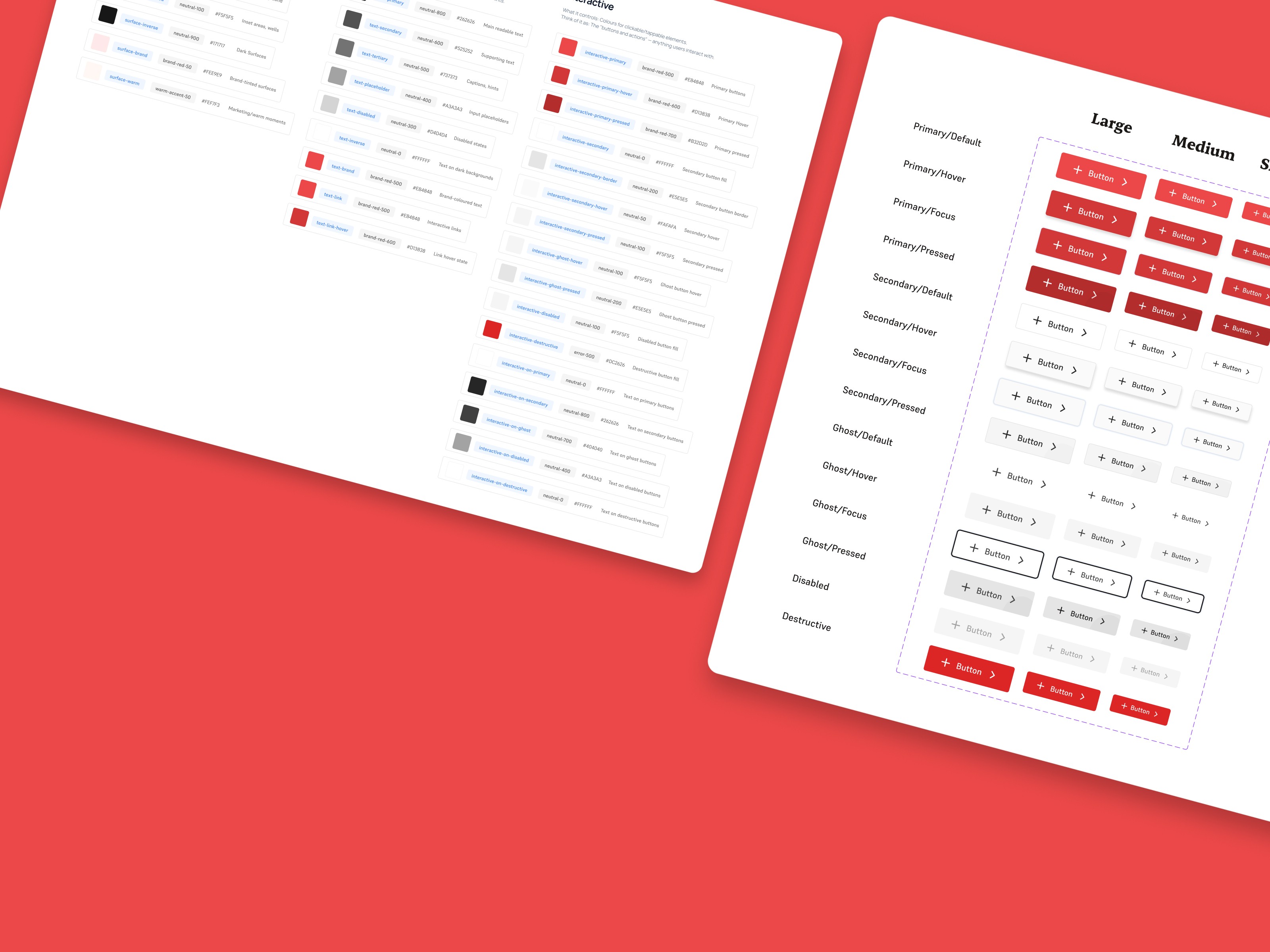
Token Architecture
Two-tier system separating raw values from purpose:
Tier
Purpose
Example
Primitive
Raw values (colours, numbers)
Raw values (colours, numbers)
red-500 ~ #EB4848
red-500 ~ #EB4848
Semantic
Purpose-based references
Purpose-based references
color-primary ~ {red-500}
color-primary ~ {red-500}
One change to a primitive cascades through every semantic reference. No hunting through files. No "which red was it again?" moments.
Design-to-Dev Handoff
Kaizer mirrors Tailwind CSS naming conventions — the same mental model developers already use. Spacing tokens, colour scales, and component variants all match the implementation layer.
The gap between design and development is where clarity dies. A system that speaks both Figma and code keeps everyone aligned without a handoff document.
colors: {
  red: { 50: '#FEE9E9', 500: '#EB4848', 600: '#D13838' },
  peach: { 100: '#FCE7D2', 500: '#E54F1A' }
}
spacing: { 1: '0.25rem', 2: '0.5rem', 3: '0.75rem', 4: '1rem' }
What I Learned
A design system is a product. It has users (designers and developers), it has UX, and it can create friction just like anything else. Treating it as "just a component library" leads to the same bloat it's supposed to prevent.
Constraints are a feature. The "maximum five options" rule felt restrictive. But when you can't fall back on "give them more options," you think harder about which options matter.


Not sure what's confusing your users?
Or email me at hello@kaizerstudios.com —
We'll respond within 24 hours
©Sean Khoo 2026. All rights reserved.
Not sure what's confusing your users?
Or email me at hello@kaizerstudios.com —
We'll respond within 24 hours
©Sean Khoo 2026. All rights reserved.
Not sure what's confusing your users?
Or email me at hello@kaizerstudios.com —
We'll respond within 24 hours
©Sean Khoo 2026. All rights reserved.